

Adding Mobile Responsive YouTube Videos
The official video embed code from YouTube uses fixed dimensions on an iFrame - so it breaks mobile designs. Fix it now and bypass warnings.
 By Ken Morico on
 In my migration to fast static websites (no content management platform) from WordPress, parts of my content needed retooling / tweaking. (OK, actually a lot.) What issue did I encounter recently?
One issue that came up was embedding YouTube videos. The official video embed code from YouTube uses fixed dimensions on an iFrame - so it breaks mobile designs. This is comical that I got a notice from Google that my video display was jacked up since GOOGLE gave me the code...
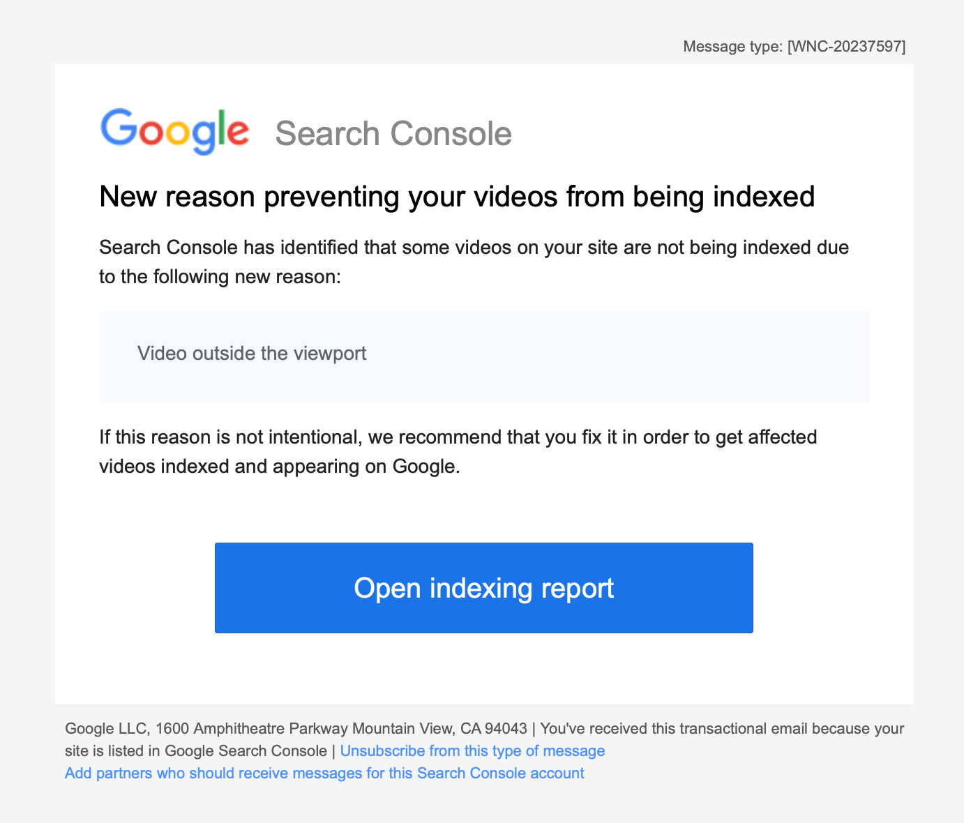
Video Outside the Viewport - Google Search Console Message
The fact that I got this urgent message very quickly (via the Google Search Console / email) tells me how important videos are to Google within Webpages... they actually de-indexed the video in Google Search. Other content doesn't get pulled this quick.
The Fix
I hate mobile sites where elements pop out of their areas. It's a serious issue and we can see why Google makes a big deal about this. Sites just look broken... and broken sites get the kiss of death from Google - untrustworthiness.
Standard Issue Embed from Google:
<iframe width="560" height="315" src="https://www.youtube.com/embed/kPDIiu3z07o?si=z_VHPho8uyvwS7kr" title="YouTube video player" frameborder="0" allow="accelerometer; autoplay; clipboard-write; encrypted-media; gyroscope; picture-in-picture; web-share" allowfullscreen></iframe>
The width is much too wide for standard phone widths. Let's add a class and remove the fixed dimensions.
<iframe class="youtube-video" src="https://www.youtube.com/embed/kPDIiu3z07o?si=z_VHPho8uyvwS7kr" title="YouTube video player" frameborder="0" allow="accelerometer; autoplay; clipboard-write; encrypted-media; gyroscope; picture-in-picture; web-share" allowfullscreen></iframe>
In your site's CSS file, add the responsive code:
.youtube-video {
  aspect-ratio: 16 / 9;
  width: 100%;
}
This will keep the iFrame sized properly. But what if you don't want to use the iFrame at all, and just want an image with a play button overlayed that doesn't load all the code associated with the video file? That would result in much cleaner code and a faster loading site.
The HTML (with markdown for the image tag):
<div class="video">
<a href="https://youtu.be/kPDIiu3z07o?si=lniGmbJv7UC5ig7Y" target="_blank">

</a>
</div>
Just replace the video ID with your video ID. No need to upload and manage image files... the thumbnails are hosted on YouTube servers.
The CSS:
.video {
  position: relative;
  margin: auto;
}

.video img {
  position: relative;
  margin: auto;
}

.video a::after {
  content: "\25B6";
  color: red;
  font-size: 72px;
  opacity: 0.7;
  text-shadow: 0 3px #666666;
  position: absolute;
  top: 50%;
  left: 50%;
  transform: translate(-50%, -50%);
}

.video a:hover::after {
  opacity: 1;
  font-size: 80px;
}
It's preferred to use the iFrame method, however, because Google will index the video file and associate it with your site. It's also convenient for users to view the video inline.
It's interesting that Google is ok with content creators removing Google AdSense (display, banner, text ads) from websites so long as YouTube stays strong. We know this by their Helpful Content update messaging.
Lesson learned: add videos and make the experience on the Web page great.